Next: CORRECTION FOR SYNTHETIC AMPLITUDE
Up: CORRECTION FOR CONSTANT AMPLITUDE
Previous: ``Under-migrated'' effect
The last problem is solved by applying the Jacobian weights discussed by Sava and Biondi (2001).
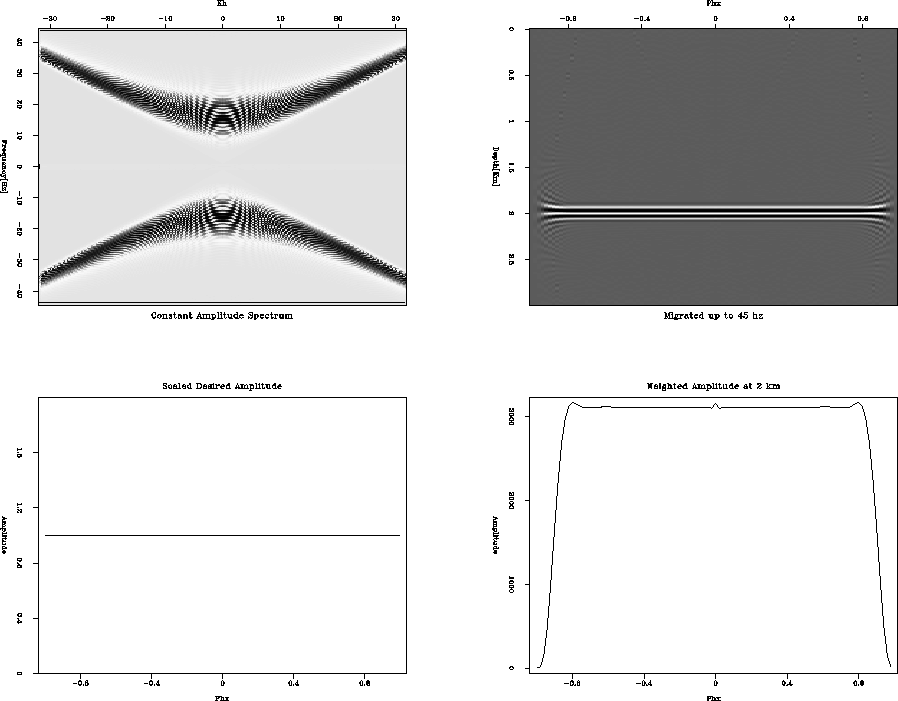
Figure 4
shows what happens to our migrated amplitudes without using the proper weights.
The top-left corner is the spectrum plot seen in Figure 3, with the lines at the top and bottom
edges of the plot showing that we
have now migrated up to 45 Hz. The bottom-left is our expected amplitude, and the top-right is
a migrated image gather. Notice in the bottom-right, which is a graph of amplitude taken at 2 km depth,
that amplitudes are actually increasing with increasing Ph.
Obviously this will present a problem when trying to interpret AVA. With the weights applied, we see that the amplitude
is much closer to constant (Figure 5).
frame_const_45
Figure 4 Unweighted migration to 45 Hz. Top left is the data spectrum, top right is
the migrated image gather. Bottom left is the desired amplitude, and bottom right is the actual amplitude at 2 km.


 frame_constw_45
Figure 5 Weighted migration to 45 Hz. Top left is the data spectrum, top right is
the migrated image gather. Bottom left is the desired amplitude, and bottom right is the actual amplitude at 2 km.
Next: CORRECTION FOR SYNTHETIC AMPLITUDE
Up: CORRECTION FOR CONSTANT AMPLITUDE
Previous: ``Under-migrated'' effect
Stanford Exploration Project
4/29/2001