|
|
|
|
Hyercube viewer: New displays and new data-types |
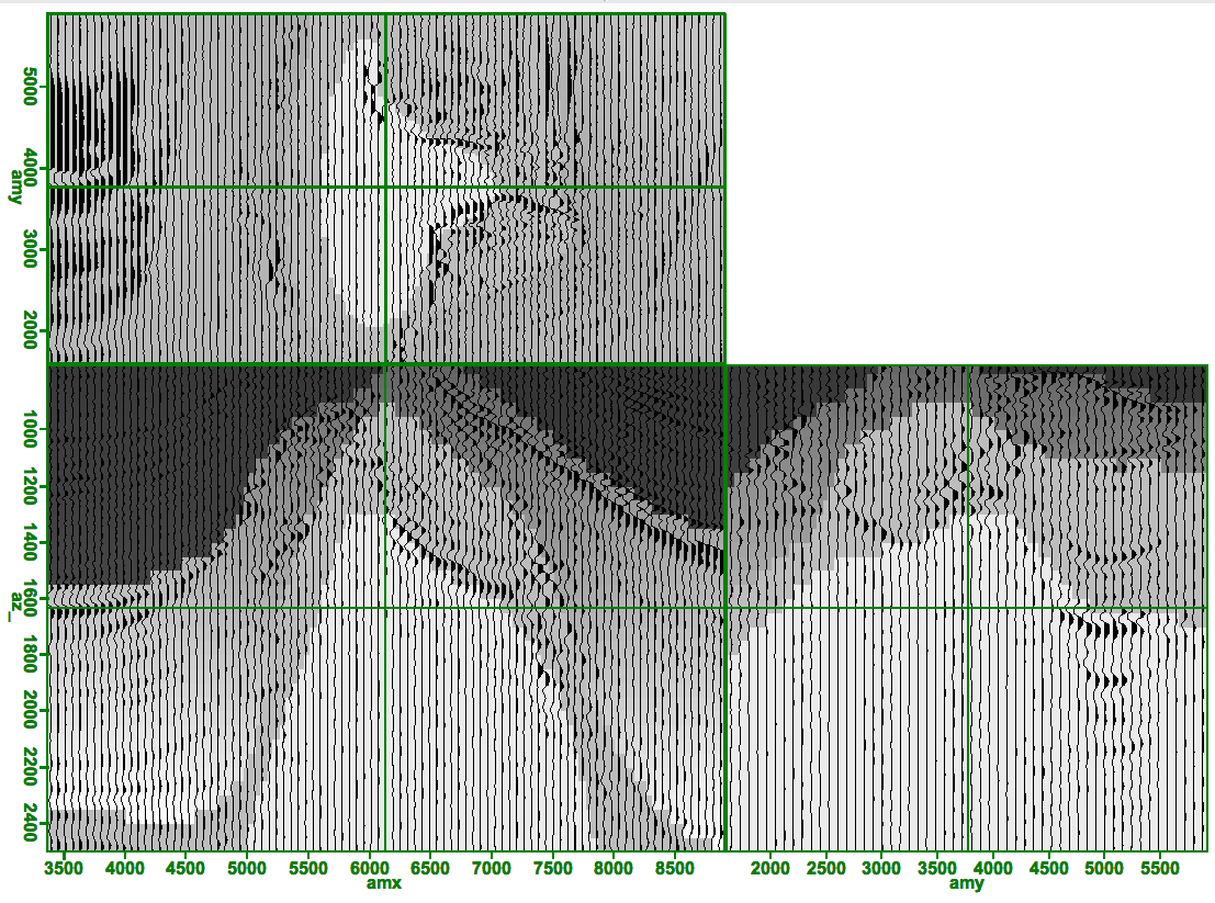
When examining waveforms it is often useful to display traces in
a wiggle format. Wiggle format allows you to see more clearly
the actual waveform recorded by the sensor. Figure 1
demonstrates hypercube's wiggle capabilities. In this case we are overlaying
a velocity model on top of a migrated volume. In order to see the waveform
each trace must take a few pixels of screen width, we chose to use a minimum
of 8 pixels. If ![]() , where n is the number of traces and
, where n is the number of traces and ![]() is
the width in pixels of the display we subsample the data volume until this
criteria is met.
is
the width in pixels of the display we subsample the data volume until this
criteria is met.
|
|---|
|
wiggle
Figure 1. Velocity model overlain by a wiggle plot of a migrated volume. [NR] |
|
|
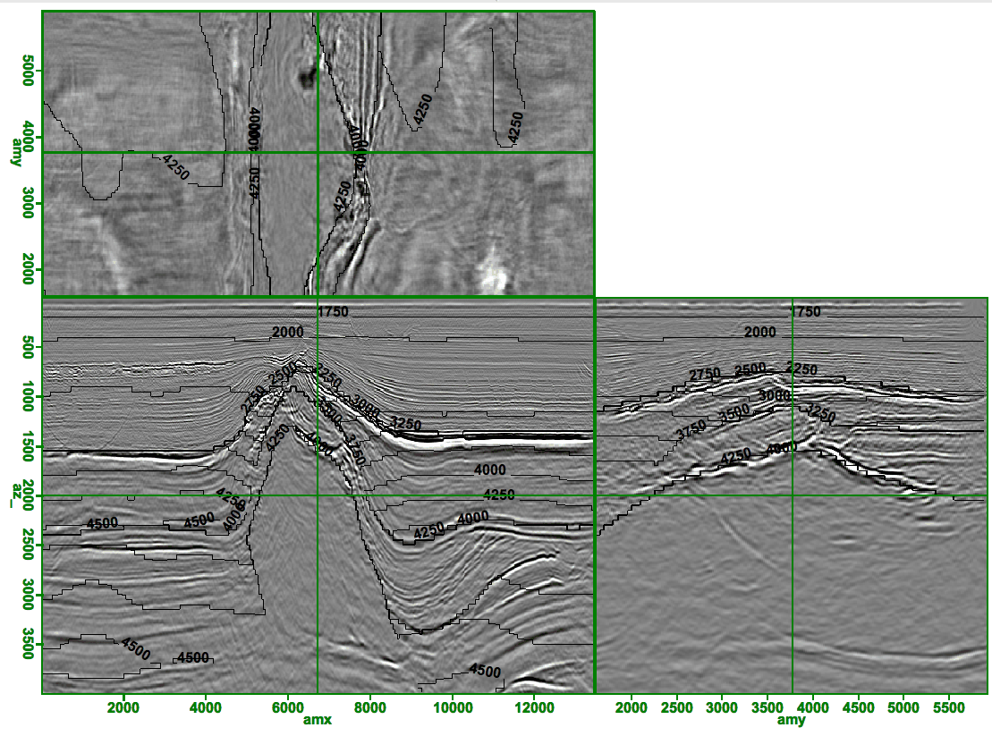
For fields that vary smoothly it is often useful to contour the data rather than display directly each cells value. Figure 2 demonstrates this concept by drawing velocity contours on top of migrated volume. The program attempts to separate contour labels by some distance. Note the jagged nature of the contour lines. This is due to storing the velocity data as a series of bytes rather floats.
|
|---|
|
contour
Figure 2. Migrated volume overlain by contours. Note the jagged nature of the contours due to the velocity volume being stored as bytes. [CR] |
|
|
|
|
|
|
Hyercube viewer: New displays and new data-types |