


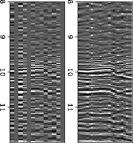
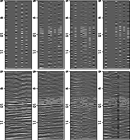
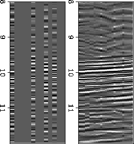
We have applied the method to a real 3-D dataset, a record from the SEP passive experiment (Nichols et al, 1989) containing a quarry blast.
The SEP passive experiment used a 169 channel array, arranged on a 13x13 grid. A group of 24 geophones, arranged in a 2-D pattern, was used for each channel. Overall the array measured roughly 500 meters on a side. Some of the recordings were timed to record blasts set off by the U.S. Geological Survey in a quarry roughly 15 kilometers away. The largest of the blasts yielded a strong signal, and a long train of arrivals incident from many directions (Cole, 1989). We used the recording of this largest blast to illustrate the action of the interpolation program.
The blasts were recorded late in the experiment, with many of
the recording instruments beginning to fail because of dead batteries.
At the time of the record used here, 87 of the 169 instruments had
failed. The interpolation scheme gives us the opportunity to estimate
the missing data. Actually the interpolations shown here, in
Figures ![[*]](http://sepwww.stanford.edu/latex2html/cross_ref_motif.gif) through , are done onto
a 25x25 grid, with half the original spacing, to make the data cube
a little larger and easier to view.
through , are done onto
a 25x25 grid, with half the original spacing, to make the data cube
a little larger and easier to view.
The dips picked by the algorithm are shown in Figure .
Most of the picks are off to one side of the center of the plot -- this
indicates a dominant arrival direction, not surprisingly in the
direction of the quarry. The range of dips for these arrivals is
consistent with other analyses that have been done on the quarry
blast data.
Note the significant number of picks around the edges, at very low apparent velocities. The prediction filtering used to estimate coherence as a function of dip is similar to a crosscorrelation of the two traces. Given a fixed data length, correlation uses more data for smaller lags than for larger lags (lower apparent velocities) where it must avoid going off the end of the trace. Coherence values for the lower apparent velocities, then, are based on less data; this introduces a bias that makes the extreme points more likely to be picked, we believe. This problem can easily be circumvented by padding the input data to allow for a uniform correlation length.
 |

 |
 |
 |
|
blast-picks
Figure 11 Contour plot of dips picked by algorithm as a function of px and py. Most picks lie below the origin, indicating energy incident on the array from the south, the direction of the quarry. | 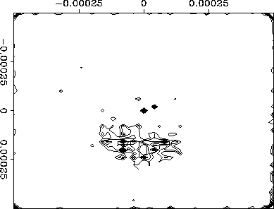 |