Next: Conclusions
Up: Balog: Interpolation
Previous: THE PROGRAM
In this section I discuss the results obtained by applying the program to real and synthetic data.
For testing the algorithm I used a series of simple linear events and a real dataset from a seismic crosswell experiment.
f1
Figure 1 Data before interpolation. Notice the two strongly aliased events.
 f2
f2
Figure 2 Data after interpolation. Despite the good performance (left) a small amount of aliased energy still remains after interpolation (right).
Figures 1 and 2 show an example of interpolation on simple linear events.
The input data consists of four events, the steepest ones strongly aliased while the other two suffer only first order aliasing, meaning that after one interpolation they should be unaliased.
The program performs very well despite the presence in the frequency wavenumber domain of some of the aliased energy after the interpolation is performed.
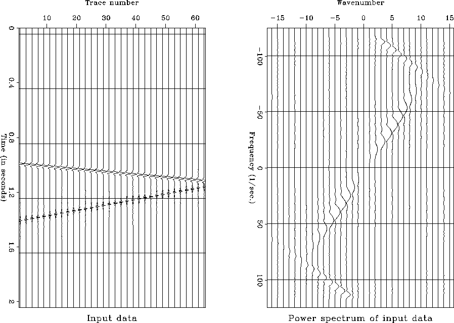
f3
Figure 3 Original data containing a high frequency event
(left, lower event).
For the second example the original data is composed of two simple linear events.
By looking at the power spectrum in Figure 3, one can easily notice that none of them is aliased and that one is a lowpass while the other is a high pass.
After subsampling once in the x direction the high pass becomes aliased while the low pass is still unaliased.
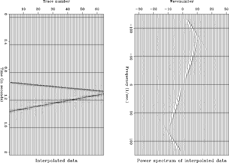
f4
Figure 4 Data before interpolation. A subsampling was performed on the original data so that the high frequency event (left, lower) became aliased (right).
The subsampled data shown in Figure 4 is used as an input to the program.
By comparing the result of the interpolation shown in Figure 5 to the original data in Figure 3 it appears that the high pass was not correctly interpolated since the aliased energy was not moved to the right place in the spectrum.
Furthermore a windowed portion of both the original and the interpolated data in Figure 6 shows that the missing traces are replicas of the known traces with a sign change.
f5
Figure 5 Data after interpolation. The low frequency event (left, upper) was perfectly interpolated. The aliased energy of the high frequency event was not moved at the correct place in the spectrum (right).
f6
Figure 6 Window on original and interpolated data showing that for the high frequency event the missing traces and the known traces have the same wavelet but with a sign change.
This example shows a limitation of the method. It fails to interpolate correctly when the data contains high frequency events with energy only above half the Nyquist frequency.
Therefore the method should be used carefully when such events are present in the data to interpolate
Nevertheless this is a very extreme case and it was not encountered with the real data that I processed for this paper.
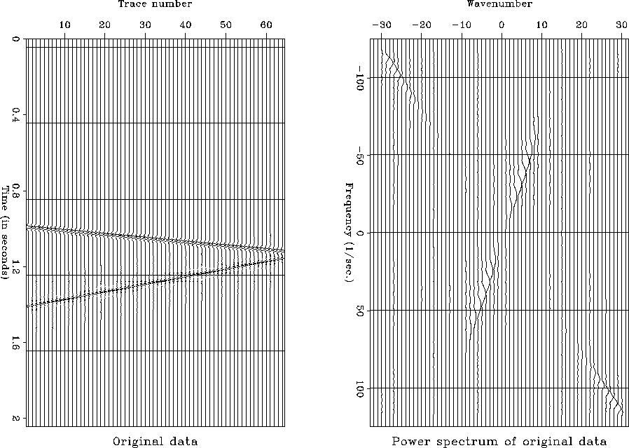
The third example was obtained by applying the program to a real dataset from a crosswell experiment.
For this example the interpolation was performed in overlapping windows containing 32 traces and 512 time samples.
Figure 7 shows the original with the strong tubewaves which are aliased.
The spacing between the stations in the borehole was five meters for the original data.
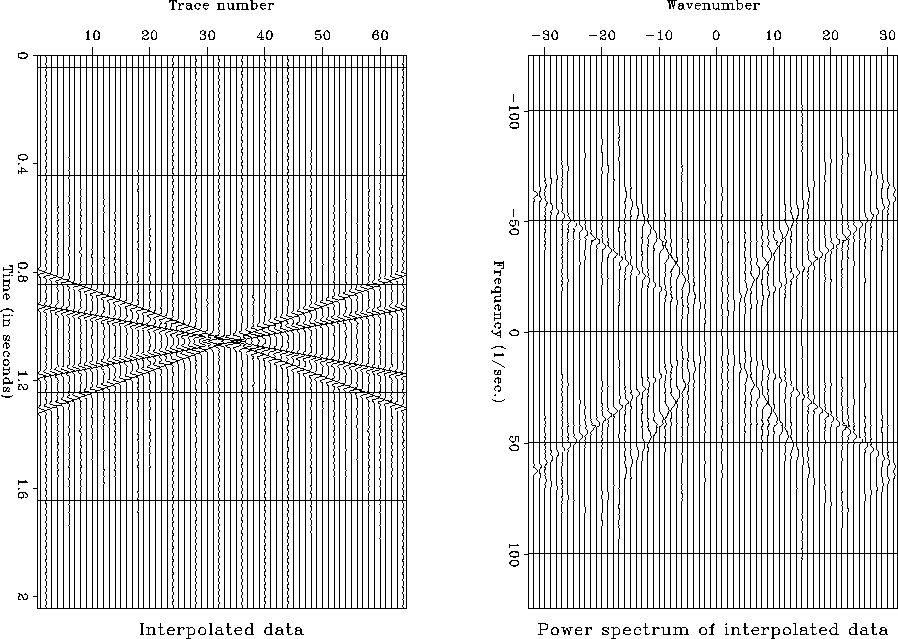
The data was interpolated twice to reduce the spacing to 1.25 meters so that the strong tube waves became unaliased.
Figures 8 and 9 show the data after interpolation.
An FK filter was applied to remove the tube wave on both original and interpolated data and then the upgoing and downgoing wavefields were separated.
In Figure 10 the upgoing wavefield is shown before and after interpolation.
The reflections in the upper part of the plot are more clear when the processing was performed on the interpolated data.
Next: Conclusions
Up: Balog: Interpolation
Previous: THE PROGRAM
Stanford Exploration Project
12/18/1997