


 |

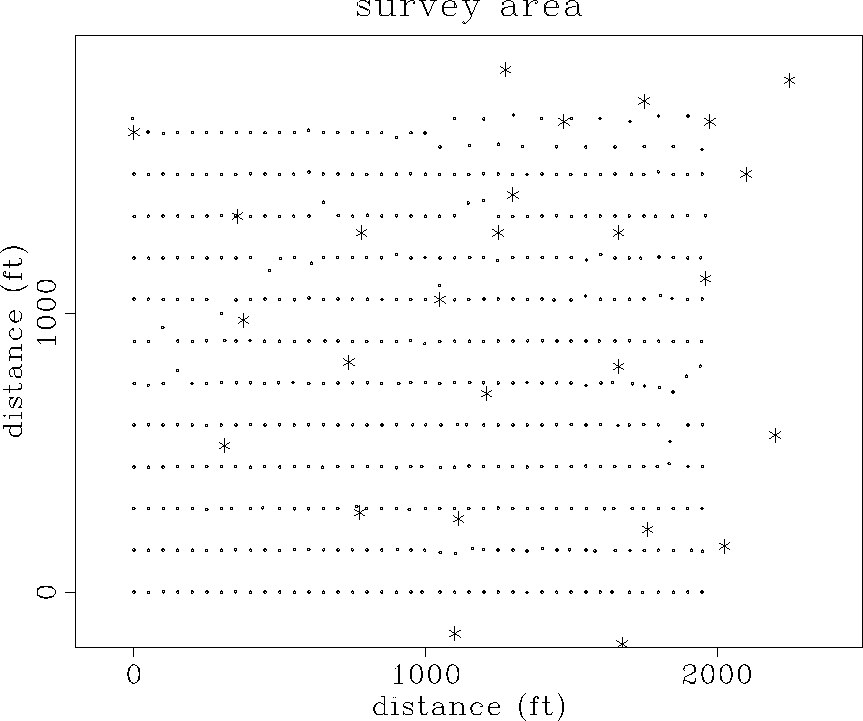
The asterisks indicate the locations of pumps. There are 26 pumps either within the boundaries of the array or close by. About half of these are operating at any time. The pumps produce strong noise that is fairly broadband, from roughly 20 to 100 Hertz, but the resonant frequency of the geophones (28 Hz) was chosen to minimize the effect of pump noise.
To date we have obtained just a few noise records, each roughly 17 seconds long. These records were obtained during a 3-D survey conducted last year. Additional noise records were taken during another 3-D survey this summer. An interesting new development in the field is that in the intervening year, a steam injection program has begun. When we look at the data from this year's survey perhaps we will notice changes in the ambient noise field due to steam injection.
Figure 2 is another plan view, this time limited to the bounds of the array, where the rms amplitudes of the traces for part of one record have been computed and plotted. The largest values are white. Superimposed on this plot are the known pump locations. Not surprisingly, the largest amplitudes are recorded near pumps.
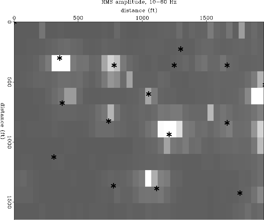 |
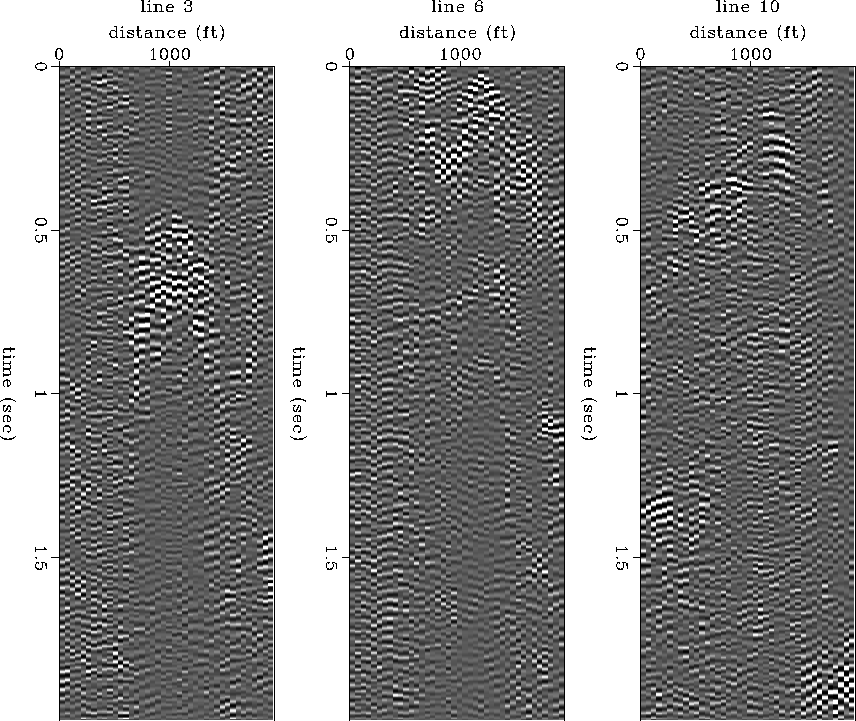
Figure 3 shows the data from three lines of the array. They are the third, sixth, and tenth lines counting up from the bottom of Figure 2. Each of these lines has at least one active pump on the line or nearby, and the energy from the pumps is clearly visible on the displays. For example, in Figure 2 we see that line 3 has a pump near its center. In the left plot of Figure 3, we see a burst of energy from this pump beginning at around 0.5 seconds. Trace balancing has been used to compensate for the decrease in amplitudes away from the pumps, and these panels have been bandpass filtered to 10-60 Hz.
In Figure 4, the data have also been filtered using a 3-D recursive dip filter. The coherency of the pump noise events is clearer after this filtering.
 |
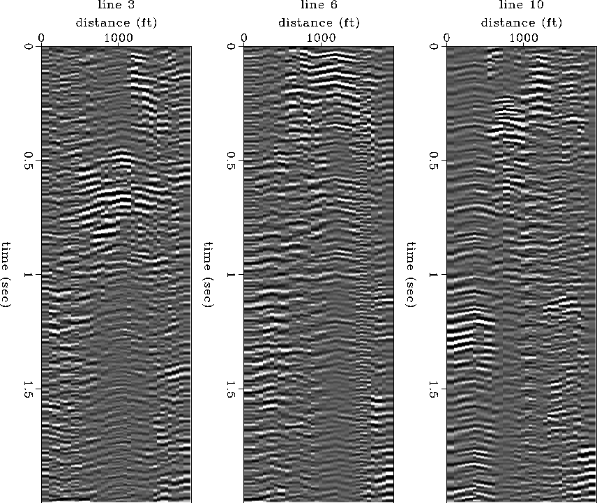 |
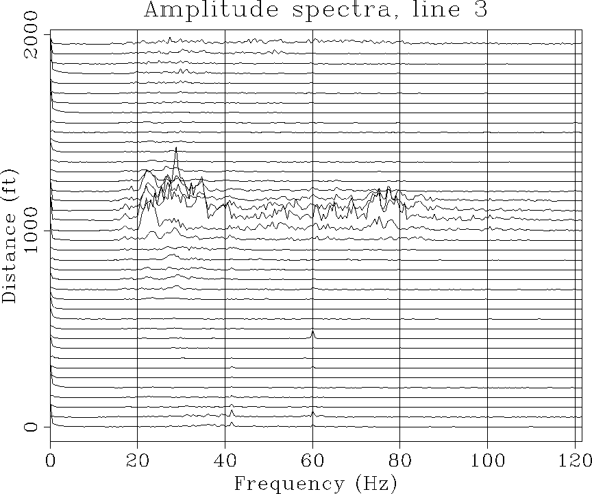
Figure 5 shows the amplitude spectra for line 3, the line on the left in Figure 3. The pump energy has a fairly broad spectrum, with abundant energy from 20 to 100 Hertz.
 |