Next: NMO correction
Up: Time-variant Filtering
Previous: Random Traces
tvf_rd1
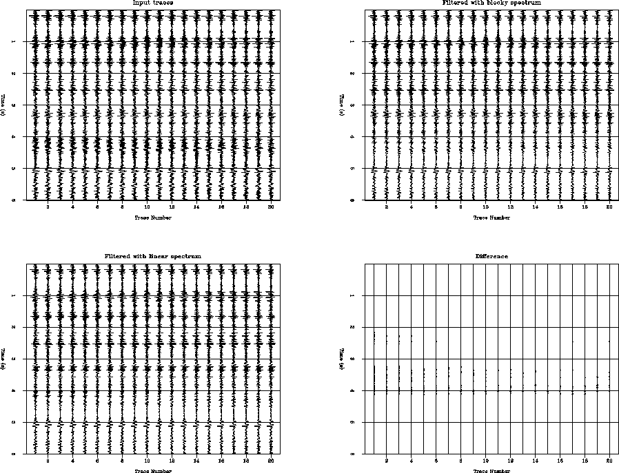
Figure 6 Real traces. On the top left, the input
data. On the top right the filtered data with a ``blocky spectrum,'' that is,
constant spectrum in each third of the data. On the bottom left data filtered
with a linear spectrum in the middle third and constant spectrum in the top
and bottom third. On the bottom right is the difference of the two filtered
datasets.


 tvf_tfa2
Figure 7 Time-frequency analysis for real data.
On the left, the time-frequency display of the input data and on the right the
result of the filter with the linear spectrum. The white areas represent large
amplitudes. The thick solid line represents approximately the high cut frequency
of the filters in every window
The top left-hand side of Figure 6 shows a few stacked traces
from a real
2-D seismic line. The top right-hand side shows the result of filtering the
data with a ``blocky'' spectrum in which again the top third of the data are
filtered with one filter, the middle third with a narrower filter and the
bottom third with an even narrower filter. The bottom left panel corresponds
to the result of filtering the dataset with a linearly changing spectra in the
middle third of the trace. The bottom right shows the difference between the
filtered datasets. This time the difference is small even in the middle third
of the trace because the original data spectrum is not very broad as shown in
Figure 7. In this figure the left-hand side corresponds to the
time-frequency spectrum of the data and the right-hand-side corresponds to the
equivalent plot for the dataset filtered with the linearly-changing spectrum.
As noted before,
there is no apparent frequency distortion arising from the sample-to-sample
change in the trace spectrum.
Next: NMO correction
Up: Time-variant Filtering
Previous: Random Traces
Stanford Exploration Project
6/8/2002