|
model
Figure 3 The reflectivity model. | 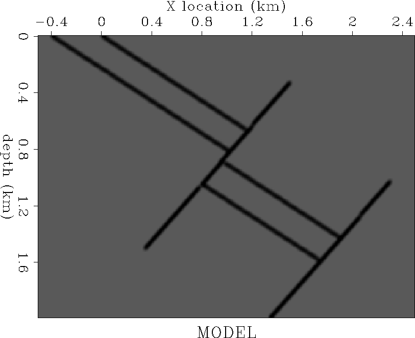 |
The model poses imaging difficulties because of the fast layer that is moved up along the reversed fault. Since the velocity in the layer is much faster than that of the surrounding material, the image under the upper section is expected to be heavily distorted when imaged with an approximate velocity. An easy way to highlight the distorsion zone is through wavefront tracing Sava and Fomel (1997), which has been shown to approximate wave propagation very well, even in regions of high velocity contrast (Figure 5).
Such a model is especially relevant for regions with large velocity contrasts and steeply dipping boundaries, for example in the North Sea Vaillant and Sava (1999) or the Gulf of Mexico, around salt domes. Dipping events tend to move laterally at every offset when imaged with different velocities; therefore residual imaging processes that do not take into account this lateral movement, like residual move-out or warping Rickett and Lumley (1998), cannot fully correct the image, but can only increase the flatness of the CIGs. Although flat CIGs are a necessary condition for a correct image, they are not a sufficient one.
|
model
Figure 3 The reflectivity model. |  |
|
slow
Figure 4 The slowness maps. The upper panel is the true slowness used to generate the data (Figure 6). The lower panel is the smooth slowness I used to create the starting image (Figure 7). The smooth model is obtained by heavily smoothing the true slowness model, with the fast layer removed. |  |
|
rays
Figure 5 A zone of distorsion is created by the fault and the upper segment of the fast layer. |  |
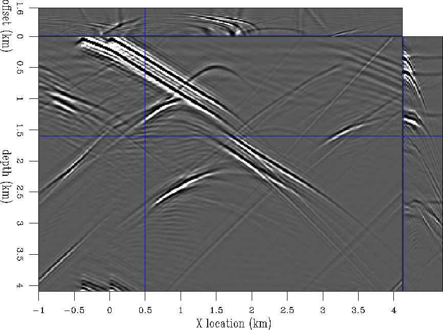
First, I generate the data corresponding to an acquisition with a cable 3.2 km long (Figure 6). I then perform wave-equation modeling using an extended split-step algorithm Biondi and Palacharla (1996); Stoffa et al. (1990) to generate data, starting from the reflectivity map and the true slowness.
 |
The next step is to create a starting image for the residual migration process by migrating the data with an approximate slowness model, obtained by removing the fast layers and smoothing the model laterally and vertically. The assumption I make is that even if we do not know much about the fast layer, we have a pretty good idea of the velocities on both sides of the fault.
 |
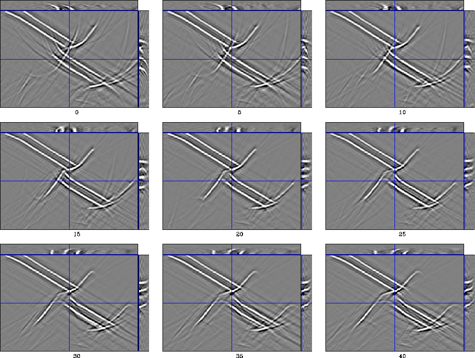
Finally, in the residual migration step, I generate a suite of 41
images corresponding to velocity ratios (![]() ) ranging from
0.9 to 1.1 (Figure 8). The values of
) ranging from
0.9 to 1.1 (Figure 8). The values of ![]() smaller
than 1.0 correspond to new velocities that are higher than the original,
while the values above 1.0 correspond to new velocities lower than
the original Sava (1999).
smaller
than 1.0 correspond to new velocities that are higher than the original,
while the values above 1.0 correspond to new velocities lower than
the original Sava (1999).
By studying the different ![]() images, we can identify two types of events:
images, we can identify two types of events:
 |
Finally, I stack all these images along their aperture-angle axis, and pick the smooth surface that goes through the points of maximum energy (Figure 10). Once I obtain the surface, I can cut through the stacked slices (Figure 9) and extract the better-focused image (Figure 11).
|
stack
Figure 9 The cube of stacked sections. Each plane represents an image at a given ratio. We can use this cube to extract both the surface of maximum energy, and the optimally focused image. Each stack has been converted to the original depth to reduce the vertical movement from one ratio to the other. | 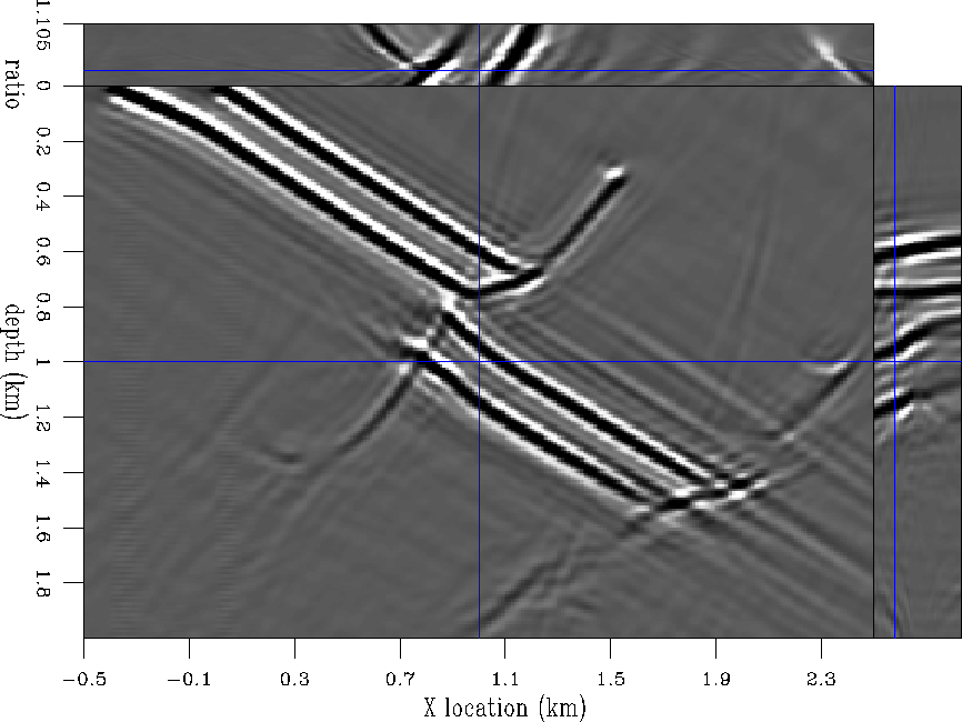 |
|
surface
Figure 10 The surface of the picking ratio. This surface represents the values of the ratio ( | 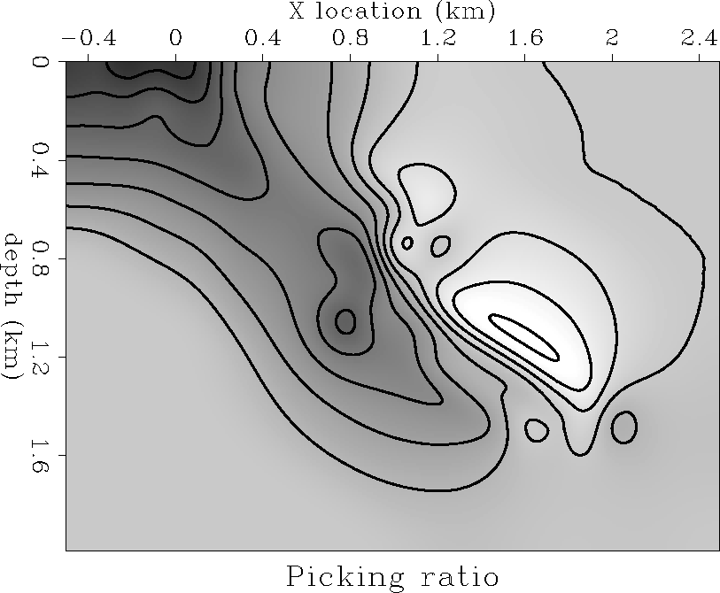 |
|
improved
Figure 11 A comparison between the original image obtained through migration with the wrong velocity (Figure 7) and the improved image obtained after residual migration and picking using the best-focusing surface (Figure 10). The area of interest is located at the horizontal location 0.7-1.1 km and depth 0.8-1.0 km. The segment of the fault in the shadow of the fast layer is moved to the right toward its correct position (A). The top reflectors (B and C), also in the shadow of the fast layer, are moved almost to their correct position and are much more energetic in the best-focused image (below) than in the original image (above). | 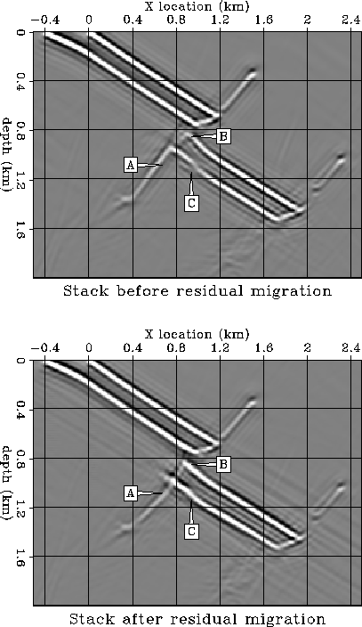 |
|
detail
Figure 12 Same comparison as in Figure 11. Zoom over the zone of interest. | 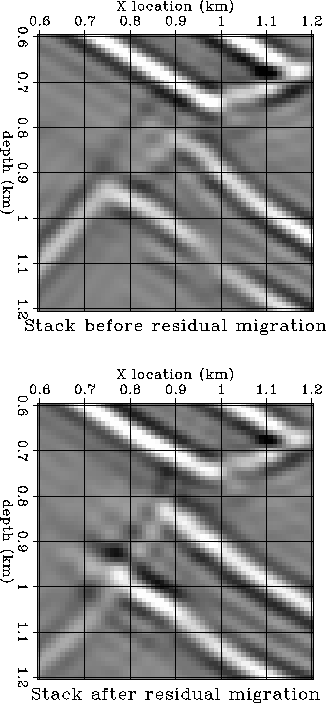 |
A simple visual analysis of the images before and after residual migration reveals the areas of improvement. First, the segment of the fault below the fast layer (labeled A in Figure 11) moves toward its correct position to the right, and in better alignment with the segment above the fault. Also, we can clearly identity the better focusing of the reflectors situated in the shadow zone (labeled B and C in Figure 11). These two events are also more closely aligned with their ideal location (Figure 3).