|
|
|
|
Correlation energy between surface and borehole stations at the Valhall field |
 -
- Hz) range we are interested in. We calculated spectrograms for the vertical components of the surface stations within
  km of the average borehole station location, the vertical components of the five surface stations nearest the platform, and the vertical components of four (out of five) borehole stations. The locations of these sets of stations are shown in Figure 1. We chose surface stations within
km of the borehole stations because it was a range comparable to the depth of the borehole stations. We chose surface stations closest to the platform because we wanted to compare signals in the borehole and signals at the entrance of the borehole. We considered only four borehole stations because one of the stations had much lower amplitude correlation results (Figure 4), which might be caused by processing errors.
km of the average borehole station location, the vertical components of the five surface stations nearest the platform, and the vertical components of four (out of five) borehole stations. The locations of these sets of stations are shown in Figure 1. We chose surface stations within
km of the borehole stations because it was a range comparable to the depth of the borehole stations. We chose surface stations closest to the platform because we wanted to compare signals in the borehole and signals at the entrance of the borehole. We considered only four borehole stations because one of the stations had much lower amplitude correlation results (Figure 4), which might be caused by processing errors.
To generate the spectrograms, we divided recordings at all stations into  -minute overlapping segments. The mean was removed from each of the time segments prior to calculating the frequency spectrum. We then averaged the resulting spectra for each time segment over the selected stations and plotted them over the entire
  -day recording period.
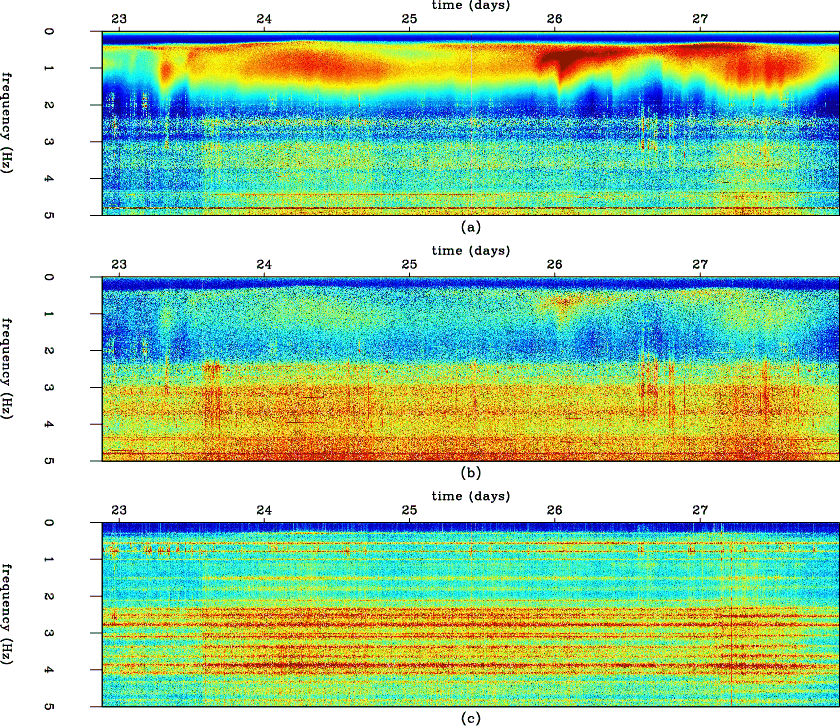
Figure 2 shows the three spectrograms that we calculated. It is evident from Figure 2(a) that frequencies from near 0
Hz to
Hz consistently contain an abundance of energy at the surface stations. The surface stations nearest the platform, as seen in Figure 2(b), show similar trends over time but with weaker energy. This low-frequency energy is least evident in Figure 2(c), where there is high energy at very specific frequencies at the borehole stations. These dominant frequencies at the borehole stations are likely hiding the low-frequency energy that is clearly visible in the spectrograms of the surface stations.
|
|---|
|
spectragram
Figure 2. (a) Average spectrogram of surface stations within
km of the borehole stations. (b) Average spectrogram of the five surface stations nearest the offshore platform. (c) Average spectrogram of the vertical components of the borehole stations. Note the energy in the lower frequencies.
|
|
|
|
|
|
|
Correlation energy between surface and borehole stations at the Valhall field |